francesco visalli inside mondriaan project 01 B130 1 1A piet mondrian

Posted by & filed under .

The first operation I carried out was to redraw the original work, respecting its dimensions down to the last millimetre, as well as the design, geometric proportions and width of the lines. I also executed this task with regard to the other 46 works involved.

The first step, in this context, involved enlarging and sub-dividing the original work into two main components: the geometric grid and the planes of colour.

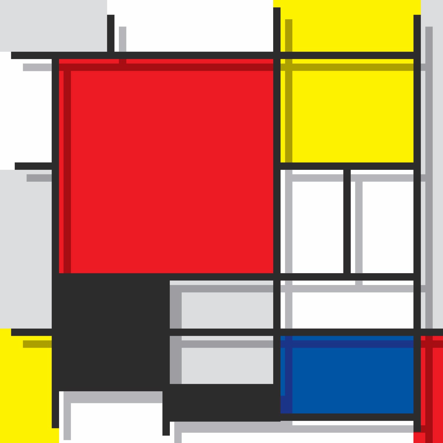
This led me to impart a sort of three-dimensional form to the composition. I imagined removing the geometric grid from the canvas, together with the black-coloured planes, and seeing its shadow projected onto the underlying plane, which still retained the layout in the original colours.

The next step was to reverse the work, inverting it like a mirror-image, so what I could see was not the stretcher or the back of the canvas, but rather the same design with opposite colours. So, black turned to white and vice versa; red became green; yellow became violet; blue became orange, and the neutral greys turned into their opposite neutral greys on the colour scale. Thus, a very light grey, composed of 80% white and 20% black, turned into 80% black with 20% white, and so on.

francesco visalli inside mondriaan project 04 B130 1 2D piet mondrian

Posted by & filed under .

There are those who maintain that individual colours do not exist in reality, but are all combined through infinite shades of grey.

I will try to explain a little better without launching into a thesis on the physics of colour, because this project is primarily concerned with painting.

In the realm of physics, this statement is completely true: colours do not exist.

They are simply wave-lengths, or vibrations with greater or lesser frequencies. They are perceived by the central photo-receptors in our eyes (the cones), transformed into bio-electric signals, and sent to the brain, which then interprets them and delivers them in the way that we see them (or believe them to be).

Newton observed that a beam of white light passed through a crystal prism divided up into a rainbow of colours. This is due to the fact that energy sources with different wave-lengths are refracted in different ways when they pass through substances with different density and therefore with different wave propagation.

Colours are often identified by wave-length or frequency. These are two ways of measurement which describe the same phenomenon using different parameters. The first measures in millionths of a millimetre the distance between one crest and another in an electromagnetic wave. The frequency method measures the number of waves passing through the same point within a second. High frequencies correspond to lower wave-lengths, so one is in inverse proportion to the other.

Perception of colour, therefore, is a psycho-physical and subjective dimension, and unique for every sighted individual. In effect, how can we be 100% certain that our particular vision (and consequent interpretation of a specific frequency) is identical to another person’s perception? We clearly cannot be sure, but are granted a certain assurance by the conditioning we have received from our earliest years.

We have stated that colours do not really exist under objective conditions, but are in fact energy frequencies and electro-magnetic waves which we interpret subjectively. From this, a second principle then emerges: that objects, and everything around us, are not in themselves coloured.

If colours are just our interpretation of wave-lengths, the colours that we see in the real world are simply wave-lengths which are reflected but not absorbed. White light is the sum total of all the visible wave-lengths. A light projected onto an object might be entirely reflected, leading our eyes to perceive white; or it may not be reflected at all, and then we see black. Or else an object could absorb certain wave-lengths and reflect others: we perceive the colour that the object has rejected.

Clearly, in the sphere of painting things are not the same: colours are colours and are perfectly identifiable at a universal level (as long as there are no problems with colour blindness).

However, there is a neutral area produced by the scale of grey, and maybe this represents the pure reality of colours.

In fact, this is simply the sum total of all the primary colours, mixed together to form black, and with white (light) added in smaller or larger quantities.

Between the two extremes, black and white, there are thus an infinite number of shades of grey.

The second step, therefore, was to start again from the first work and change its colouring; removing every coloured element and depicting the planes solely in neutral colours in shades of grey. The planes that were grey or black in the original work remained the same, while those in the three primary colours were changed into their respective shades of grey.

This was therefore a different, alternative way of observing the pure entity solely in the scale of grey.  Once again, I reversed the work and examined its exact opposite, applying the same inversion technique in shades of grey.
francesco visalli inside mondriaan project 05 B130 2 1A piet mondrian

Posted by & filed under .

The key element in Mondrian’s work is that he only uses straight lines.

In this third phase, I wanted to explore the possibility of transforming the original geometric grid into a network of curved lines.

In technical terms, the operation involved maintaining the basic design intact, and applying a form of “circular distortion” starting from the centre of the picture and blending out towards the edges.

This activity could involve working either in a clockwise or an anti-clockwise direction.

In addition, as with all the other works I worked on, I found it was possible to vary the level of curvature from time to time. That is to say, I could start from the centre with a larger or smaller radius, conferring a different level of “force” to the original design.

Particular attention had to be focused on the way in which the lines and black planes became contorted, carefully calculating their angles and width so as to ensure that the transformation of the design corresponded precisely to the particular level of distortion.

For this third phase of distortion, I went back to the original work, therefore making no changes to the colour scale. As with the previous steps, I also performed the opposite operation.

francesco visalli inside mondriaan project 08 B130 2 2D piet mondrian

Posted by & filed under .

The fourth phase involved performing the same operation as in the second phase, that is to say: changing the colours on the scale of grey, maintaining the “distorted” design, and then doing the opposite activity.

francesco visalli inside mondriaan project 10 B130 2 1E piet mondrian

Posted by & filed under .

For the fifth phase, while still maintaining the same “distorted” design, I completely emptied the work of any form of colour, just preserving the grid and the black planes. This allowed the basic geometry of the piece to emerge, set against the pure white background and with a total absence of colour.

After this, the work was inverted to produce its opposite. While at the previous step there was a striking absence of colour, here I used a combination of the three primary colours.


francesco visalli inside mondriaan project 11 B130 1 1E piet mondrian

Posted by & filed under .

The sixth phase involved repeating the previous one and performing the opposite operation to the third phase. So, it entailed re-using the grid in its original form but leaving the planes without colour.

francesco visalli inside mondriaan project 14 B130 3 1E piet mondrian

Posted by & filed under .

) I have identified the seventh phase as a sort of “stylization” of the work.

By eliminating the markings of the grid and working on its imprint, I envisaged theoretically puncturing the two backgrounds of the black and white canvases and painting on a scale of grey just the stylized shading which resulted.

Only the planes that were originally black, or conversely white, would remain as they were.

francesco visalli inside mondriaan project 16 B130 3 1A piet mondrian

Posted by & filed under .

The eighth and final phase involved starting again from the last one and reinserting the original planes of colour, while leaving only the imprint of the grid.

Those planes which were originally not coloured remained “punctured”. On the other hand, those in the three primary colours have been given some light shading, as if they were slightly recessed in the canvas.

In this case as well, there was a play of opposites.

I applied the same form of transformation, together with all the preceding ones, to each of the other selected works.

I would like, however, to point out one detail in relation to this last phase, with regard to works nos. 36 to 46.

These contain some small patches of colour not surrounded by black lines. They look as if they are not trapped in the grid, but are instead free to move about.

And so it follows that the areas of canvas surrounding these coloured patches do not require “stylized puncturing”.

The result is that these patches appear rather like cracks, or like windows in the face of a modern   building, constructed to a rationalist design.

Better still, I would say that the end result exemplifies, in a stylized form, the very spirit on which the “De Stijl” movement was founded.

Indeed, one of Mondrian’s pictures could well be construed as the architectural image of a building.

In this regard, I would not exclude the future possibility of making a series of sculptures, which would reproduce the images I have created in three dimensions, in particular the images from this last phase.